

Fancy Foods
Mobile App Design Case Study
By Charity M. Jantzen
Now you can have white glove service and dining delivered to you.
The Product
Fancy Foods directly brings the luxury of Michelin 5-star dining to you—wherever you are. With our mobile app, you can enjoy exquisite cuisine created by world-class chefs, tailored to your preferences, and delivered to your chosen location. Enhance your dining experience further by adding professional wait staff, who will provide impeccable service to ensure flawless detail.

Understanding The User

User Research: Pain Points
Navigation
It was not clear to most of the users how to add items to their carts from everywhere except the shopping cart and checkout screens.
Interaction
Moviegoers feel rushed when they attempt to purchase anything at the theater.
Experience
Most users felt that the Home page did not have enough information.
Persona: Rachel Walker
Problem statement:
Rachel Walker is a busy professional and working mother who has a visual impairment. She often needs to order exquisite food on short notice. Rachel desires independence, wants to impress her clients, and aims to get promoted so she can spend more quality time with her family.
.png)
User Journey Map
This journey map was created by analyzing the results of usability tests and conducting an affinity diagramming session. It provides a clear narrative of the user's experience with the application, starting from the moment they sign in and continuing until they complete their order. The map also highlights the user's emotions throughout the entire process.

Starting the Design


User Flow
Before beginning I map out the user flow and use this as a guide as I start to build the pages. I find this extremely helpful when working alone and on projects that have a fast turnaround. In addition, the user flow provides me a method to track completed, outstanding, and what is considered out-of-scope designs as I am designing.

Paper Wireframes
After looking and hearing about what other food delivery apps offer, I wanted to design a system with features no other app has and, most importantly, is accessible to those with visual impairments.

Digital Wireframes
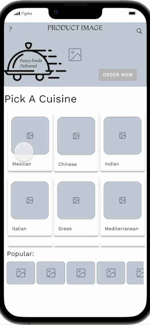
My goal when creating the wireframe was to develop a design showcasing all the different types of cuisine available to order. Therefore, when I interviewed users, they wanted to see what options were available.

Digital Wireframes
Based on my initial research, users wanted to see large images, and from the beginning to search by cuisine rather than being presented with a smorgasbord of options. Then they wanted to be able to filter from there.
Low-fidelity Prototype
Walk through the home, search, checkout, and track order feature of the Fancy Food app.
Explore the low-fidelity Fancy Food Delivery App yourself.
Usability Study: Parameters

Study type
Moderated usability study

Participants
5 participants

Location
Remote usability study

Length
20-30 minutes
Usability Study: Findings
These were the main findings uncovered by the usability study:
.png)
Interaction
Users had difficulty using the slider control on the milage dropdown.
.png)
Navigation
Users would like to see a search bar on the home screen.

Filtering
Users want to be able to filter when restaurants are open.

Redefining The Design
Mockups
My goal with the mockups was to create an interface that was usable and fresh. Learning color theory and how to apply the colors pushed me beyond my limits throughout the process because working with colors is not my strongest area. Now I feel more confident to accomplish any color task.

Mockups


High-fidelity Prototype
Accessibility Considerations
My main concern was to ensure that people who are colorblind could easily Differentiate between all the different icons, shapes, buttons, and background colors within the application. I also confirmed that the colors were not the only way to identify information.
I wanted to ensure that individuals
with physical limitations could operate the application with less pain.
I accomplished this by delivering straightforward and consistent navigation options and interactive features that are readily identifiable.
I provided interactive elements that were clear to identify and presented at the correct speed for all users.
Going Foward

Takeaways
Impact
“Very beautiful app! I love the animations and the first one when the tray thing slides up from the top.” - Anthony Jordan
“Wow, Charity, absolutely beautiful design! I love the colors that pop! Great app.” - Emily Senz
What I learned
I learned a lot from the UX research study plan and working to identify patterns and themes.
I love working with the design libraries in Figma; they offer great potential for large projects to have consistency and to make changes quickly.
Next Steps
Moving forward, I would love to flesh out this app with more accessibility features such as a rich voiceover for each menu item and possibly explore using the haptic feedback to interpret braille for the deaf and blind.
I would love to get this project usability tested at the school for the blind with users to get their feedback to make technical enhancements to the app. and implement the feedback given because I think it’s vital that you always test your product as
you design.
I want to market this app to a vendor to see if anyone is interested in the idea. This app could be a good investment for some communities that like fine dining at their desired location; it would be nice to see it come to fruition.