
Overview
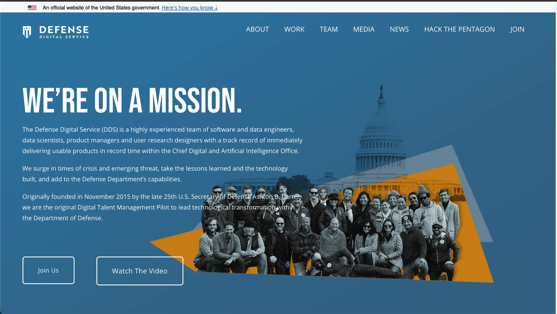
Make the mission clear before asking people to decode the organization.
DDS worked across highly technical, high-consequence problems. The website needed to translate that complexity into a public story that felt direct, credible, and distinctly human.
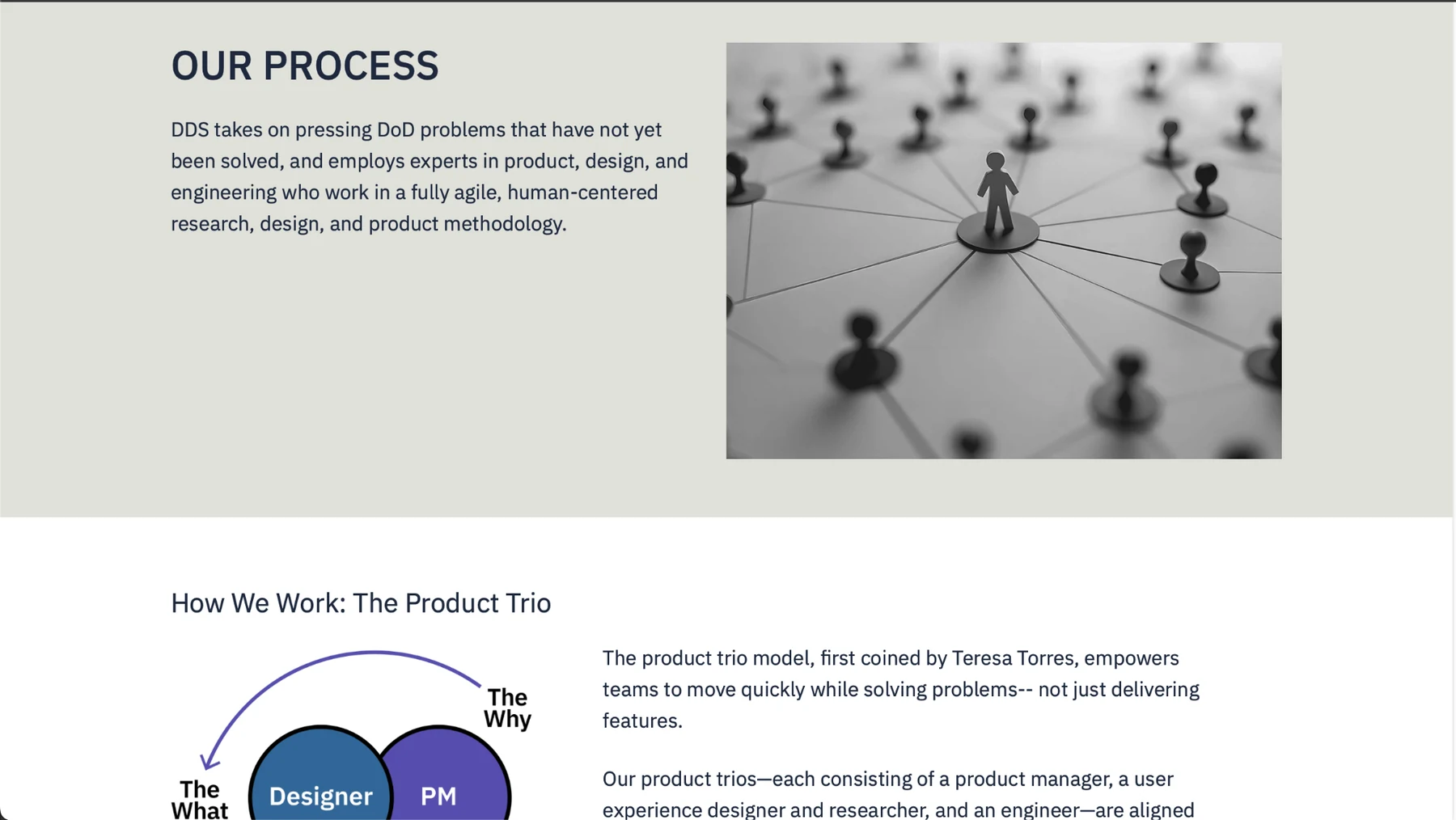
The content had to answer several questions without making visitors hunt: Who is DDS? What does the team work on? How does the team operate? What has it built? And where can someone learn more or join?
Design principle: lead with the mission, then show the people, process, and evidence behind it.
Design direction
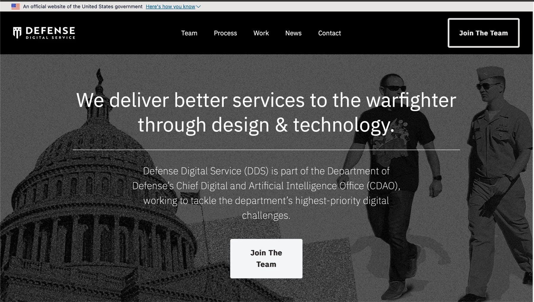
Bold enough for the mission. Structured enough for the content.
The experience was structured to reduce cognitive effort: predictable navigation, clear hierarchy, readable content groupings, and consistent patterns helped visitors understand where they were, what information was available, and what to do next.
Mission first
Large, plain-language statements give visitors an immediate reason to care.
Editorial rhythm
Full-bleed moments alternate with quieter content areas so dense information remains scannable.
Human evidence
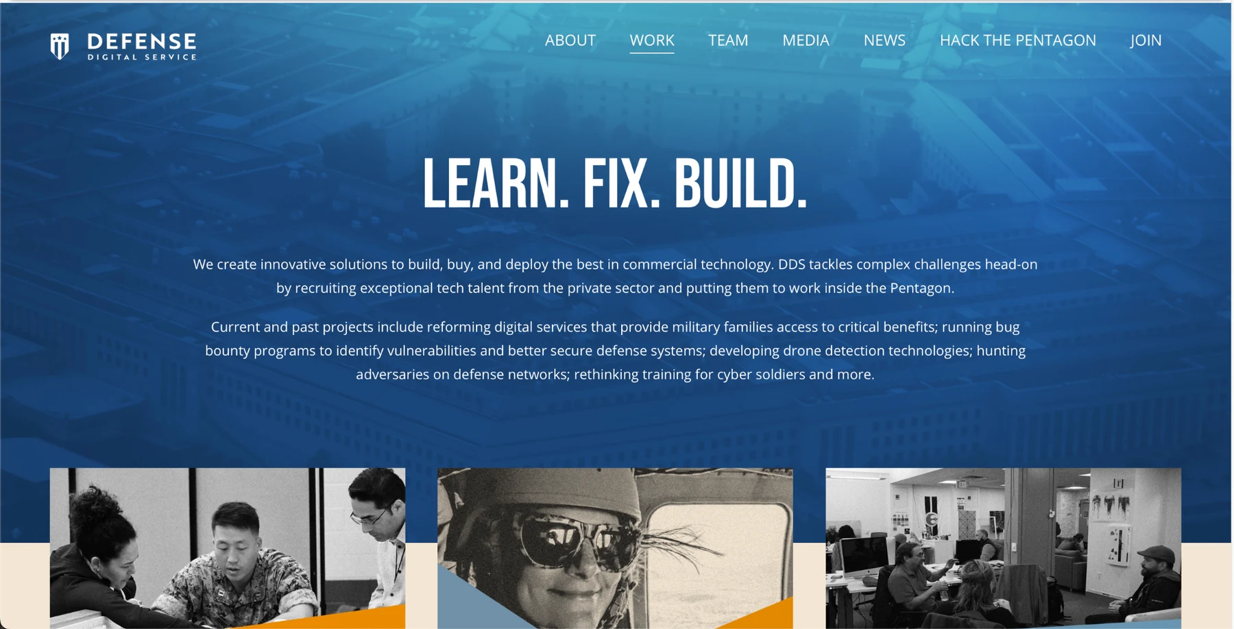
Team photography and real project imagery keep the organization from feeling abstract or institutional.
Flexible identity
The same system can support mission, culture, technical work, recruiting, and news without forcing every page into one layout.
Content system
Give each visitor a clear doorway into the story.
Instead of treating the site as one long marketing page, the content was organized around distinct user questions: who the team is, how the team works, and what the team delivers.
Product storytelling
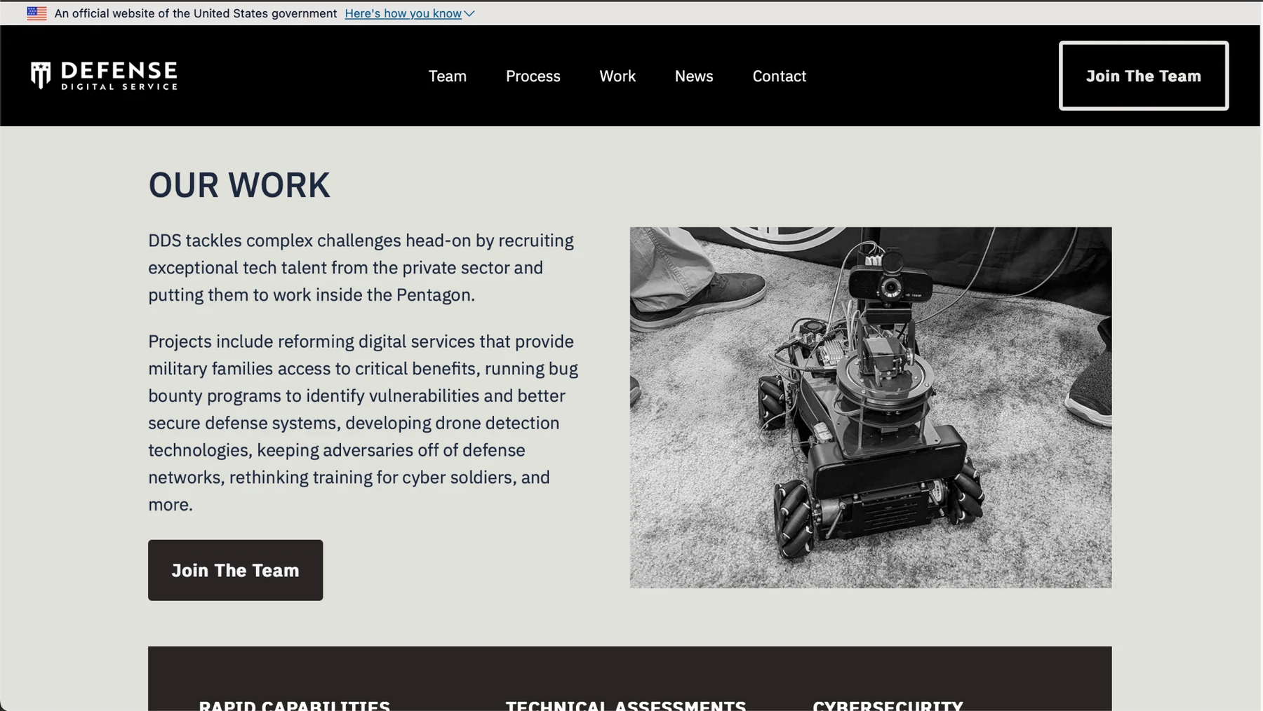
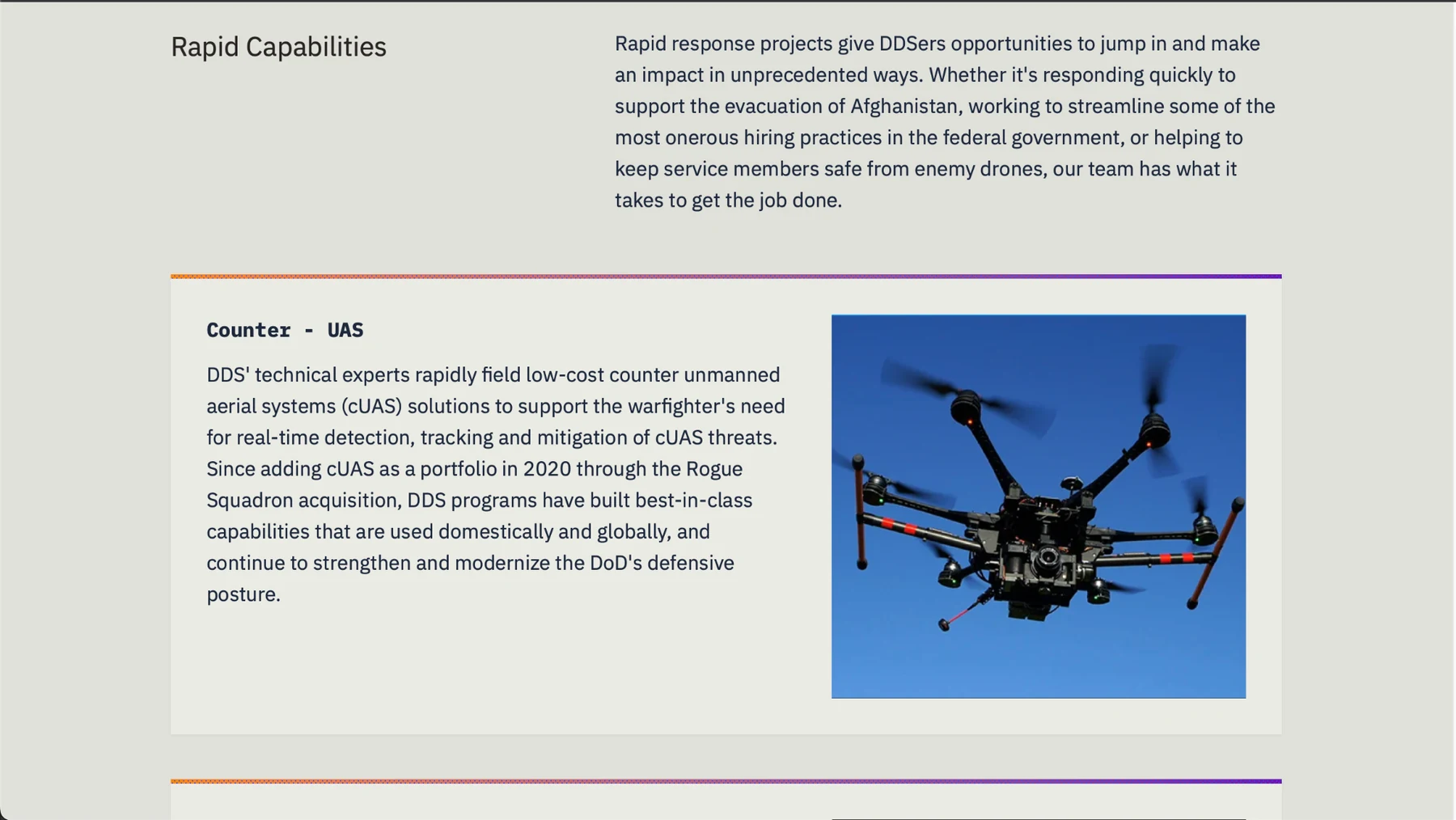
Turn technical programs into stories people can actually scan.
The public experience needed room for both capability-level narratives and individual projects, from counter-UAS work to logistics and AI-enabled interfaces.
SERVICE EXPERIENCE
Move.mil
A consolidated experience for military personnel managing household goods during a Permanent Change of Station, bringing scheduling, customer service, and key information into one place.
MISSION OPERATIONS
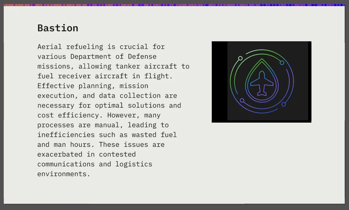
Bastion
A pilot focused on improving aerial-refueling planning by bringing advanced digital technology and constraint optimization into existing operational processes.
AI + PHYSICAL SYSTEMS
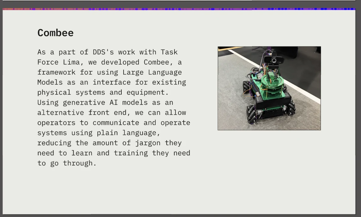
Combee
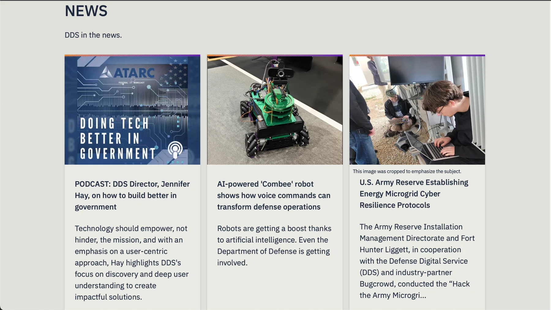
A framework that uses large language models as an interface for existing physical systems, allowing operators to use plain language instead of learning additional jargon.
Culture + process
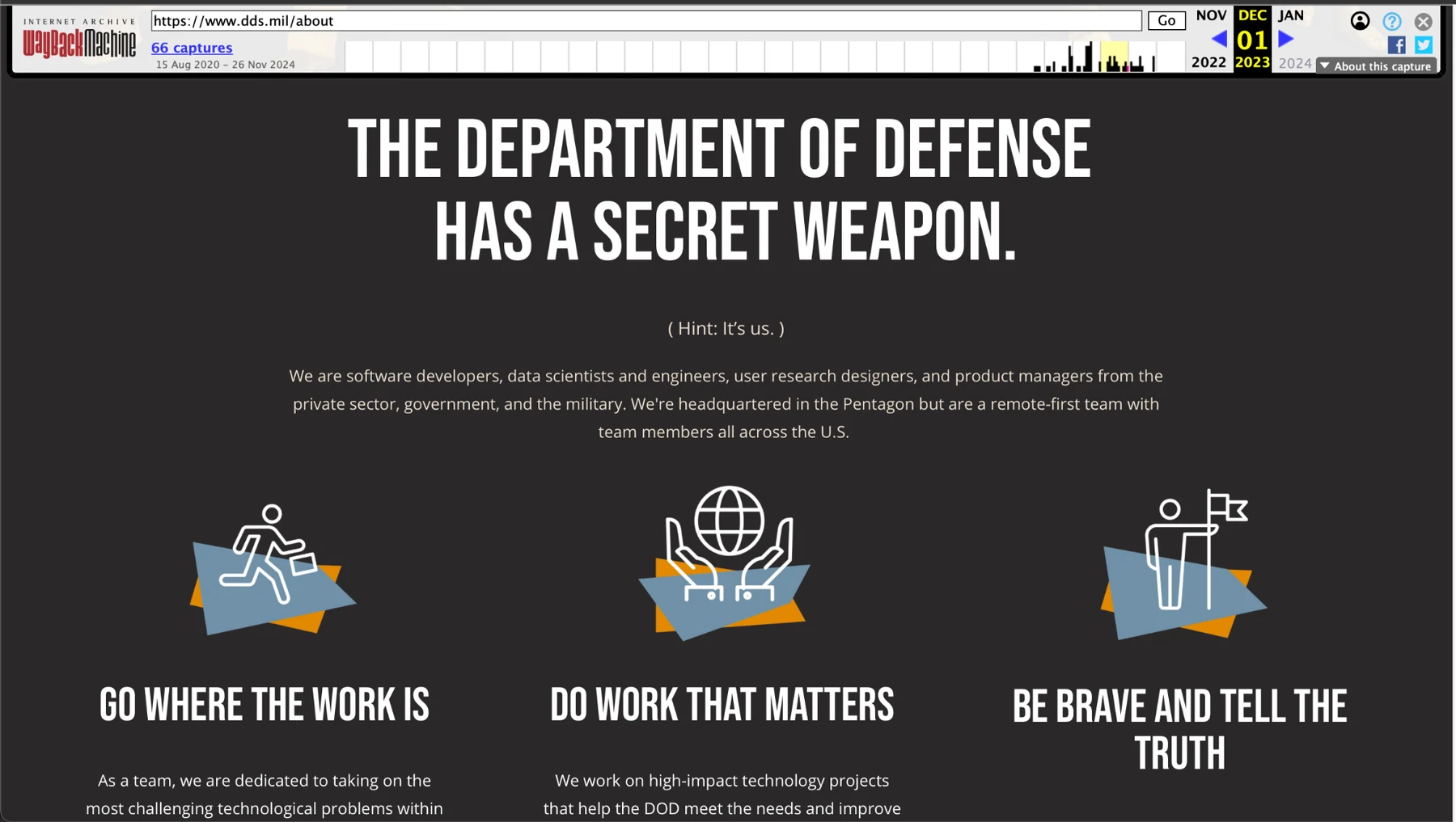
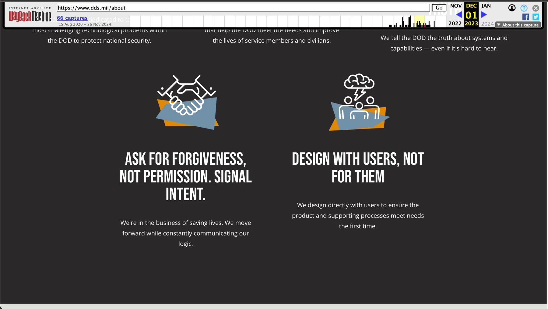
The brand had to communicate how the team behaves—not only what it ships.
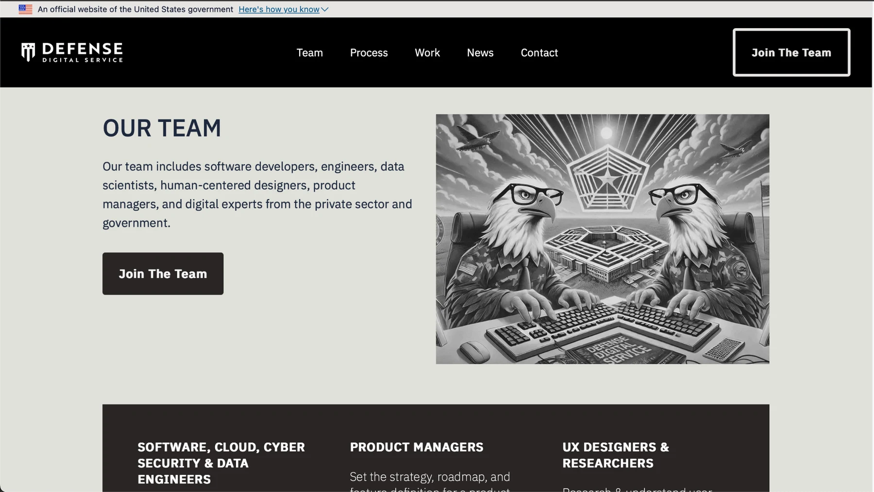
The darker values pages created a different emotional register from the blue mission pages while keeping the same direct voice, geometric accent language, and high-contrast presentation.
Editorial flexibility
A strong system also has to handle ordinary content gracefully.
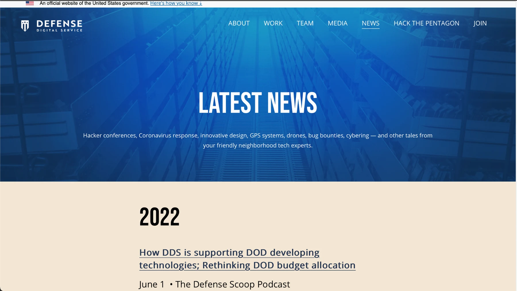
News and media are less cinematic than a homepage. The challenge is preserving the DDS identity while supporting archives, cards, dates, headlines, and variable-length editorial content.
Accessibility
Government-facing visual design has to work beyond the hero image.
The design direction prioritizes strong text contrast, readable hierarchy, obvious navigation, large interactive targets, clear link language, and layouts that can collapse predictably on smaller screens. In a production environment, those visual decisions still need to be verified with keyboard, screen-reader, zoom/reflow, and user testing.
Contrast
Dark blues, black, cream, and white provide a dependable foundation for readable text.
Navigation
Consistent page structure and descriptive labels reduce the cost of finding the next destination.
Responsive hierarchy
Content is organized in modules that can stack without losing meaning or sequence.
Reflection
The strongest identity was not a single homepage. It was a system that could hold many kinds of truth.
DDS needed to feel urgent and mission-driven without becoming visually chaotic. The most durable design move was creating a clear hierarchy and a small set of recognizable visual behaviors that could stretch from recruiting and culture to technical projects and news.
For me, the work reinforced a broader principle: complex organizations become easier to trust when the interface makes the story legible—what matters, who is doing the work, how decisions get made, and what has actually been delivered.