
Overview
Making a premium food-delivery experience feel effortless.
Fancy Foods explores how a mobile ordering experience can help busy customers discover high-end restaurants, tailor meals, understand delivery timing, and stay confident about what happens next.
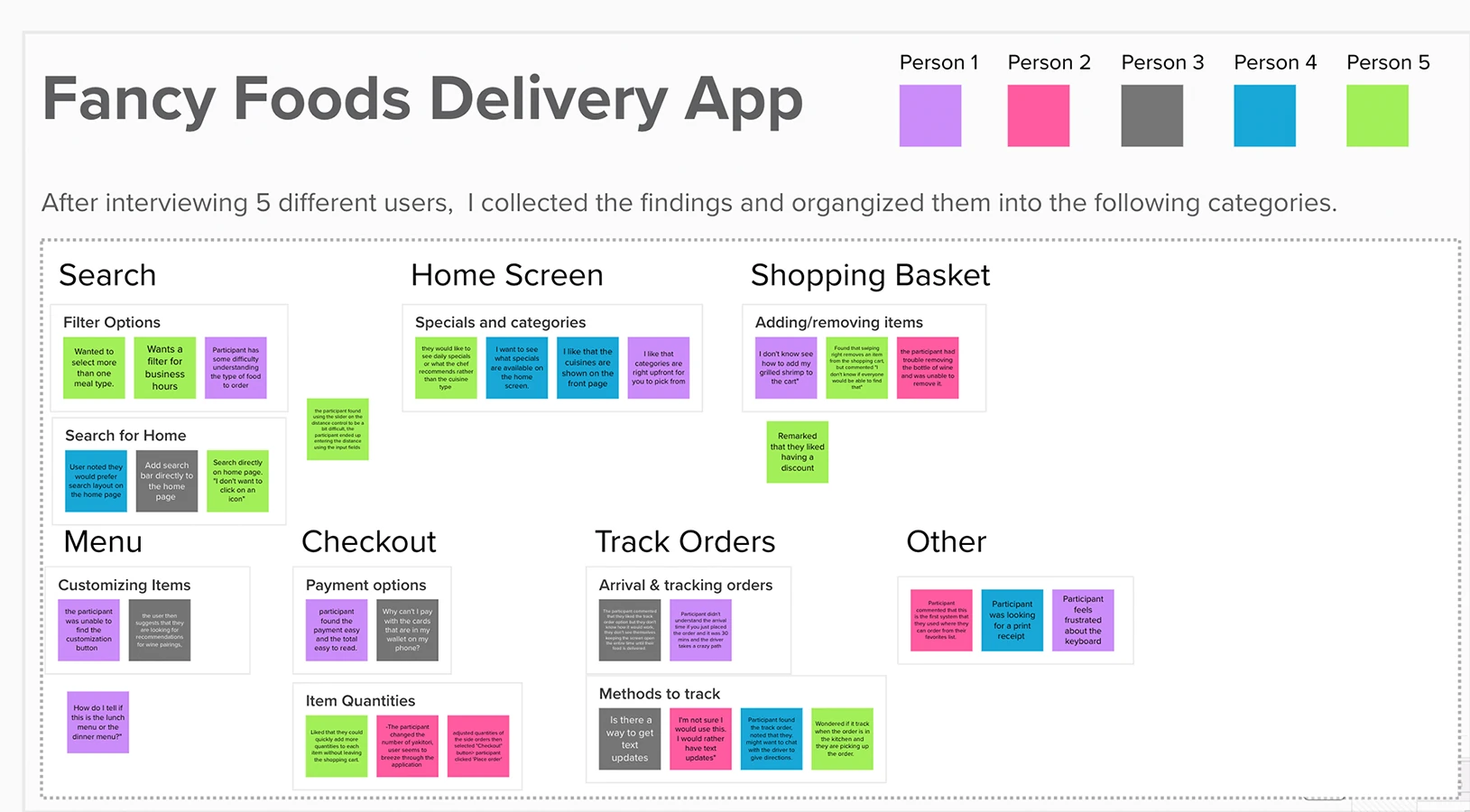
The concept grew from research with five users and focused on recurring needs around restaurant discovery, filtering, item customization, basket management, payment, and order tracking.
Design question: How can a high-touch dining experience become simple, transparent, and easy to navigate on a phone?
Research + synthesis
Five interviews turned scattered observations into design priorities.
The affinity exercise grouped findings across Search, Home Screen, Shopping Basket, Menu, Checkout, Track Orders, and Other. That synthesis made it easier to distinguish one-off comments from patterns that affected the end-to-end experience.
PERSONA SIGNALS
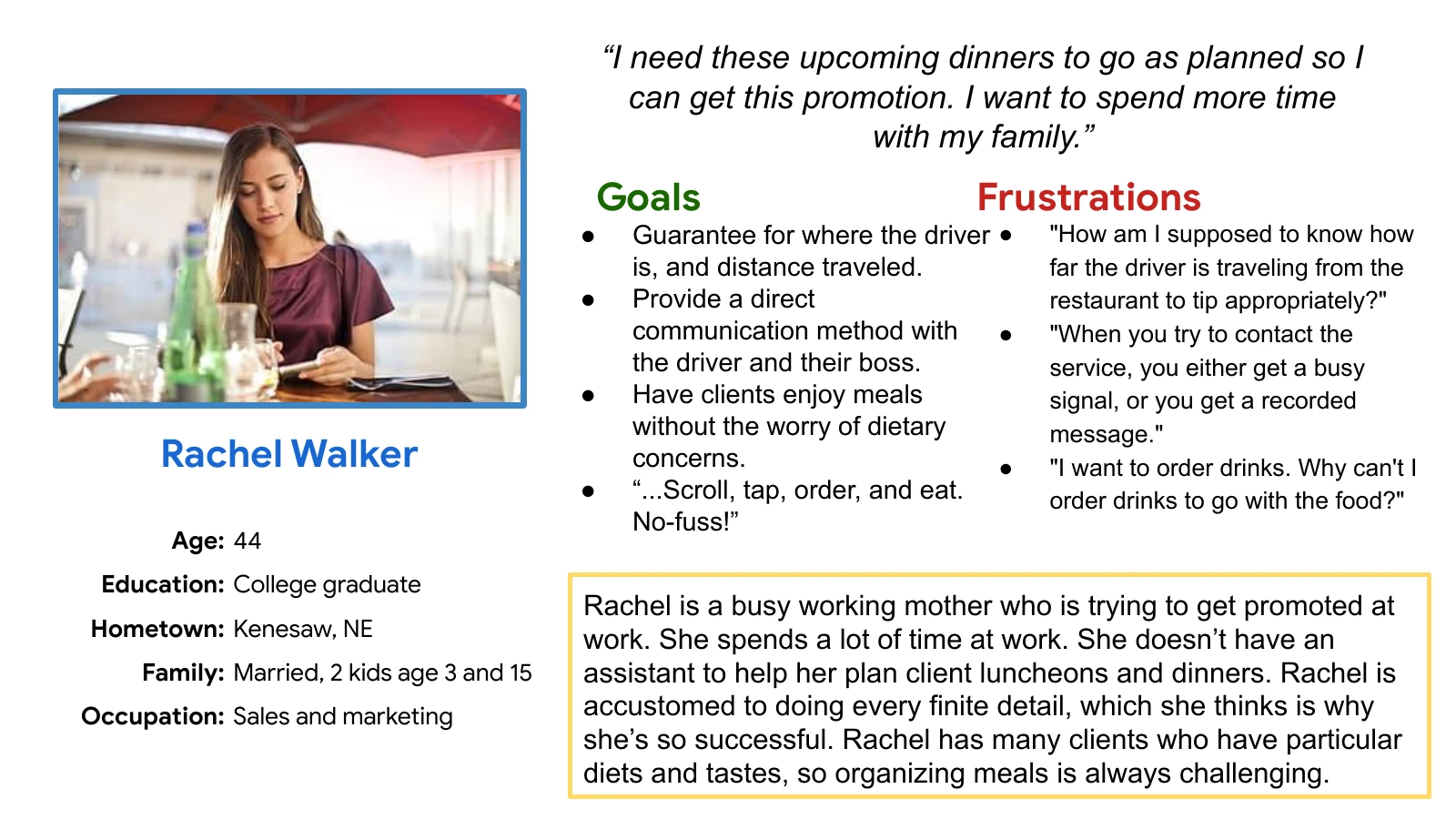
Trust depended on visibility and control.
- Know where the driver is and how far the order has traveled.
- Communicate directly when something changes.
- Protect dietary requirements without adding more coordination work.
- Keep the experience fast: “Scroll, tap, order, and eat. No-fuss!”
Early concepts
Move quickly on paper, then make the interaction testable.
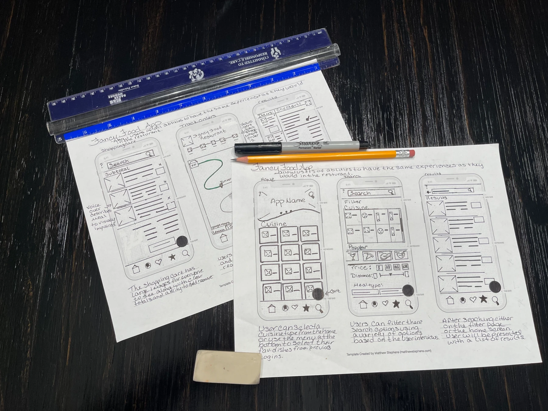
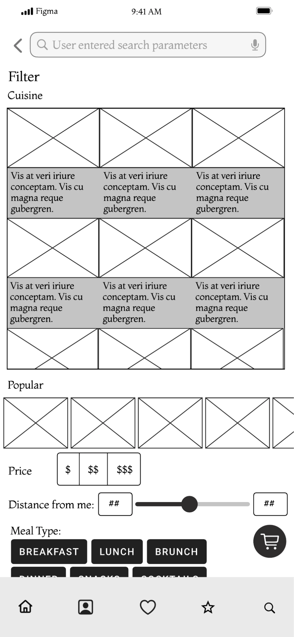
Paper sketches explored search, results, restaurant details, checkout, and delivery tracking before visual polish. The digital wireframe then made filtering behavior more concrete through cuisine, popular items, price, distance, and meal-type controls.
Final experience
The story became one continuous journey.
The final storyboard connects a spontaneous need with restaurant discovery, menu exploration, customization, real-time tracking, and a clear delivery confirmation.
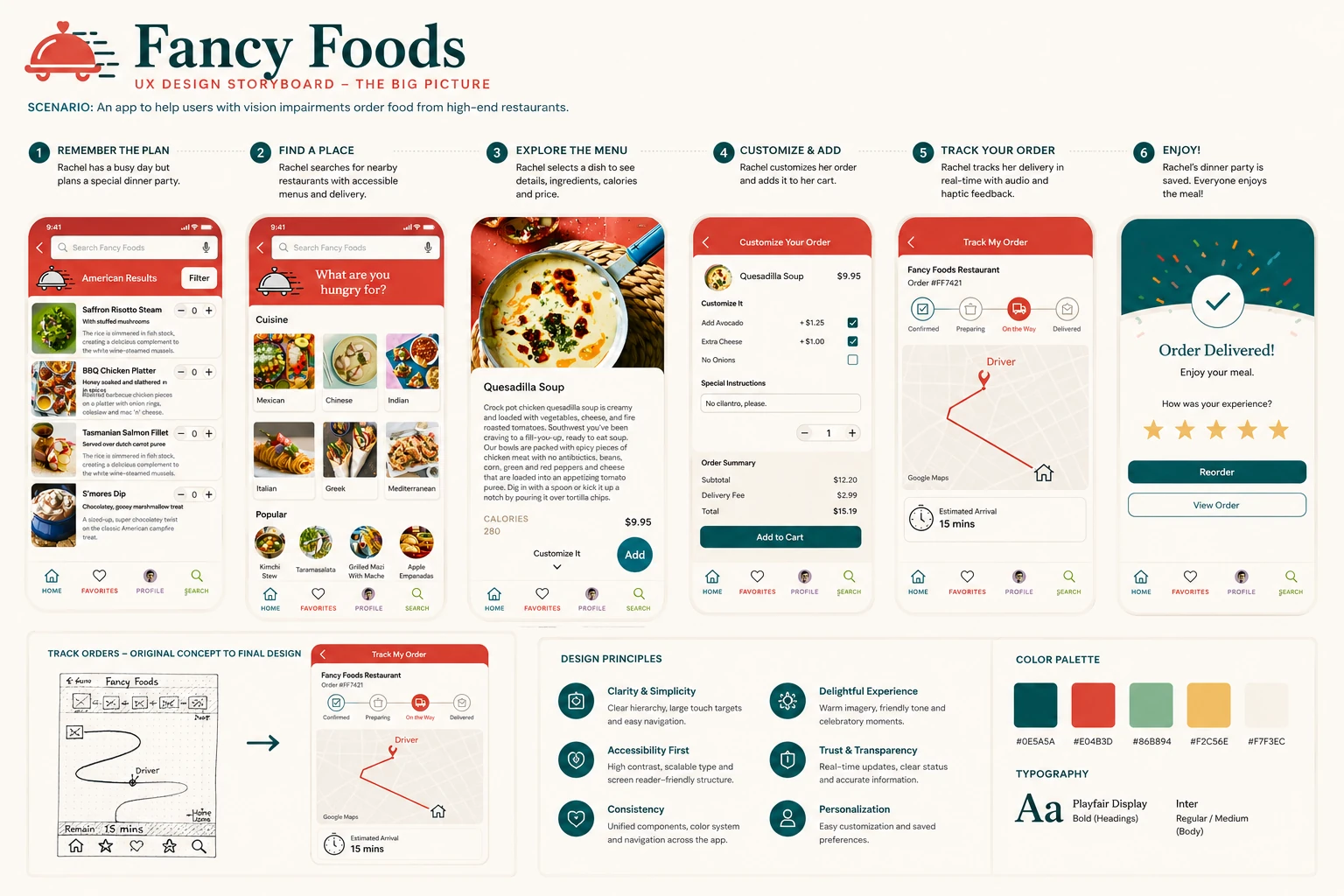
Clarity & simplicity
Clear hierarchy, large touch targets, and easy navigation.
Accessibility first
High contrast, scalable type, and screen-reader-friendly structure.
Consistency
Unified components, color system, and navigation across the app.
Trust & transparency
Real-time updates, clear status, and accurate information.
Research insights
The strongest findings were about finding, controlling, and tracking.
Search needed better filtering
Users wanted to narrow restaurants by cuisine, availability, price, distance, and meal type rather than browse a long undifferentiated list.
Basket actions had to be obvious
Research surfaced friction around adding, removing, and changing item quantities, making cart controls a priority for refinement.
Tracking needed more context
Users wanted clearer delivery progress and more than one way to receive updates when an order was on the way.
Design decisions
Translate research patterns into fewer moments of uncertainty.
Search and filter from the start
Let users begin with cuisine, price, distance, meal type, and availability instead of scanning an undifferentiated catalog.
Make customization explicit
Keep add-ons, special instructions, quantity, and total cost visible together so customers understand the impact of each choice.
Keep order status visible
Show confirmation, preparation, on-the-way, delivery, route context, and estimated arrival in one tracking view.
Close the journey clearly
Confirm delivery, invite feedback, and make reorder or order-detail actions easy to find without creating another search task.
Accessibility
Clarity and accessibility were treated as product qualities, not add-ons.
The final design direction emphasized high contrast, large touch targets, scalable typography, consistent navigation, redundant status cues, and interaction patterns that do not rely on color alone. A production version would still require screen-reader, zoom/reflow, keyboard or switch-access, and disabled-user validation.
Reflection
The research made “premium” less about decoration and more about confidence.
Customers needed confidence that they could find the right restaurant, tailor an order, manage constraints, and understand delivery status without extra effort.
The broader design takeaway is that sophisticated service should not create sophisticated friction. The system can hold the complexity while the customer sees a clear next step.